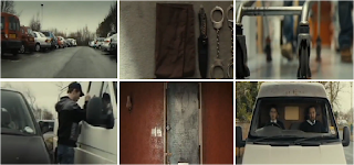
As for the victim who is being kidnapped , she will be around the age of 18 , portrayed to be a typical student looking forward to going out and meeting friends. We see the girl getting ready through the window putting on her makeup , we want to portray innocence out to the audience so that they feel even more sorry for her when something bad happens to her. The girl will be dressed casual , but nicely as if she were on her way out.
Tuesday, 25 January 2011
Character Description
For the role of the two kidnappers , the characters will be in their early 20's , specifically made to look like the average man. As the opening is set outside with the men coming out of B&Q, we decided that it was key to the story line for them to blend in with the setting , acting as if they worked as labourers. They will be dressed in dark dull colours which connotes anger and power , wearing dark jeans , working boots and a painted jumper to give the illusion to passers by that they are the average work men. As they do not speak once throughout the opening , their personality needs to be shown through their actions. We want the audience to feel the determination that these two men have for what they are about to do . The shot where the camera faces the car dead on to show the two men waiting patiently will portray this to the audience, showing sheer concentration.
Script and Casting
As a group we decided that we wouldn't include dialogue in our opening sequence as the awkward silence would add to the suspense and tension that we want to create. The only sound we are going to use is a soundtrack during the car journey from B&Q to the girls house . This will enhance the awkward silence which is created in the car by the two men not speaking. Another sound which we will use will be the exaggerated sound of a ticking clock , this will be used as the two men wait for the girl to leave her house , causing the audience to feel anticipation.
The casting for our opening sequence will one girl and two men. . We decided to cast Alan and Tre as the kidnappers as they fit the intended look we wanted. Both of the kidnappers are very tall so that they don't look like an odd match.
As for the girl being kidnapped , we decided cast myself as we wanted a teenager around the age of 18 , which fitted perfectly within our group. We wanted the girl to look innocent so that the audience would feel more sympathetic towards her.
Shooting schedule
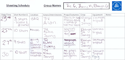
23rd January- shooting the first 8 shots for scene 1 and 2 at B&Q.
25th January- shooting 10 shots at the house where the girl is kidnapped.
27th January- shooting 9 shots of the girl being taken to the hostage location
30th January- shooting 10 shots of the girls tied up in the hostage location
Tuesday, 18 January 2011
Titles
- Very Damaged
- Assassins Dub
- Fluoxetine
- Rough Linen
- Project Y
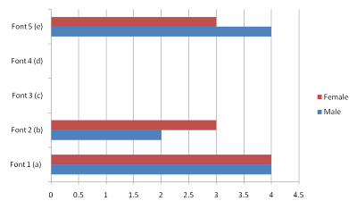
These different font types are some ideas in which we will use to show our titles in our opening sequence of our thriller. After researching many thrillers and getting a rough idea in which fonts work best and suit the genre best , we decided that large, bold capital letters that are scratchy and distorted convey the thriller genre to that audience best. We have also seen this example many times during the opening credits , so is proven to work well as it has been used in Hollywood movies.
Saturday, 15 January 2011
Friday, 14 January 2011
Research soundtracks
http://www.freesound.org/samplesViewSingle.php?id=32424b - Hypnotic heartbeat
http://www.freesound.org/samplesViewSingle.php?id=108841 - Heartbeat
I would use this soundtrack at the very end of my opening when we see the shot of the girl tied up to the chair. I think this soundtrack would work well as it could represent her heartbeat increasing. As the camera slowly works its way up her body using close ups , the heartbeat would increase giving the audience the illusion that she's becoming more and more frantic.
http://www.freesound.org/samplesViewSingle.php?id=107356
This soundtrack I would use to show the tension in the car as the two criminals wait for their victim .The ticking of the clock reinforces the fact that they are waiting and causes the audience to feel anticipated.
http://www.freesound.org/samplesViewSingle.php?id=102722
This sound effect of a car boot shutting I would use as the car boot closes as the shot cuts to a black background with the title of the film appearing. The effect of the exaggerated sound is that its very loud and definate , it causes the audience to be threatened.
Thursday, 13 January 2011
Shot Lists
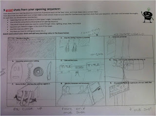
The reason in which we chose for a title to appear on a black screen is that from the perspective of inside the boot , when the boot closes it will cut to a black shot to show the darkness inside the boot. The effect of this is very threatening and definate.
The second shot is the establishing shot which shows the audience the setting and gives them an idea of the location in which the film is taking place. Many thrillers take place in everyday locations , the effect of this is that the audience do not expect anything to happen in such a normal, everyday place.
The third shot shows the audience the costume through a close up , also the shot is just a well framed shot , being interesting rather than just showing the audience a mid shot of his whole costume. Another interesting shot is the shot where the camera pans across all of the tools in which the criminals are planning to use during their kidnap. As the camera pans across the tools in which they are going to use become more menacing , making the audience guessing which is going to come next.
Sunday, 9 January 2011
Initial Ideas
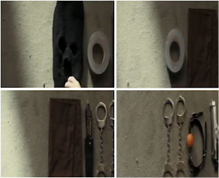
These screen grabs from the film 'The disappearance of Alice Creed' show the tools which the criminals are using , as the camera pans from left to right showing the different tools that they are going to use during their kidnap. This clip show the criminals putting each tool into a bag and has inspired us to create a similar shot using this as a starting point.
This shot shows the determination on the criminals face which makes the audience believe that they will not stop at anything to sucseed in this crime. We are going to use a similar shot to portray the same message to our audience.
This shot from Hurtwood House Media entitled 'Blood is the Drug' is a shot which I though was very cleverly done. The camera is acting as the girls eyes , and showing us what she sees as the car boot is opened. Taking on this idea of using the camera as the victims eyes , we though of the idea of when she is in the boot , she move the camera frantically to show her looking side to side wondering where she is.
Saturday, 8 January 2011
Audience Research 2
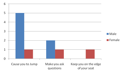
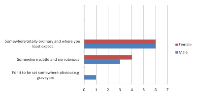
1 ) When watching a thriller do you want it to ?
3) When watching a thriller , which do you prefer ?
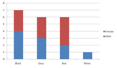
4) Which colour do you think best suggests power ?
3) When watching a thriller , which do you prefer ?
4) Which colour do you think best suggests power ?
5) Which of these fonts best suit the thriller genre
Conventions of an opening sequence
The conventions of an opening sequence include : close ups which limits the audience to keep them guessings. This was we are not being given too much of the storyline away leaving us with questions we want to be answered , so we want to watch the rest of the film. An opening sequence should grab the audiences attention and keep them as involved as possible. If the opening is dull they won't watch the rest.
Another element which an openin sequence should have is the film titles. The film titles are obviously there to tell the audience who took part in the creation of the film and the title , but can also be used to drop subtle hints into what is going to happen in the film.
The background colours to the titles can connote certain things , such as the yellow background used during 'Wallander' which suggests danger. The white lettering 'Psycho' which changes to red also connotes death and danger.
Conventions of a Thriller
A thriller should provide the audience with thrills and keeps them of the 'edge of their seats'. Tension should arise when a character or characters are put in a life threatening situation, a mystery,or trap from which escaping seems impossible. All of these characteristics would leave the audience guessing how they are going to escape un-harmed.
Close ups should be used to give hints or to foreshadow what is going to happen later on in the film. The soundtrack or music used to accompany any shot should add to the tension leaving the audience to feel apprehensive
Location Research
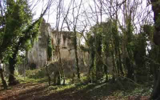
Betchworth Castle - Derelict castle
This would be a good set as its very succluded with not much around , a perfect place to commit a crime and not be found or disturbed.
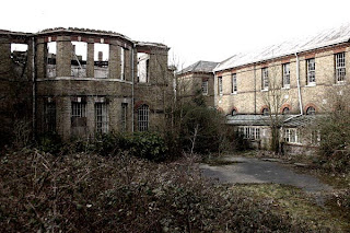
Cane Hill Asylum
This would be a good set as its very succluded with not much around , a perfect place to commit a crime and not be found or disturbed.
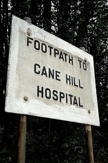
Cane Hill Asylum
Thursday, 6 January 2011
Genre Research 'The disappearance of Alice Creed'
The setting and location to the film ' The Disappearance of Alice Creed' is revealed through the camera acting as our eyes inside a car . ( Technique often used by Alfred Hitchcock)
We automatically know that the film is taking place somewhere urban and busy. The only sound that we can hear is the noise of an aeroplane overhead , which suggests to us the place is very quiet , allowing them to easily steal the van.
The shot I chose to show costume and props , I particularly like , as the camera pans across all of the tools that they are going to use during their kidnap. All lined up along the floor ,the camera shows the audience through a close up , two at a time , making the audience guess which horrific tool is going to be revealed next.
During the opening shot we can see that the men are dressed as labourers trying to fit in when they go into the hardware store , ensuring that they don't stand out. Through watching this it has helped me and my group to realise that it is crucial to think of things like this during the creation of our opening scene.
Interesting camera work includes the shot where the camera shows a close up of the trolley wheels , and in the background slightly out of focus we can see the feet of the two criminals. I chose this shot as we can still tell what is going on but without the obvious shot of just showing their whole bodies pushing the trolley. It also adds a sense of mystery not being able to see their face. The opening sets the story up as straight away we see the two men breaking into a van . From this we can tell that they are criminals and planning to do something. Even though they are not going into the shop buying knives and guns , the soundproofing material that they buy makes the audience wonder and question why they are buying it and what they are planning to do with it.
The opening suggests the thriller genre , due to the focus that the two men have constantly . They do not talk to one an other at all , but the sound that accompanies them , such as the ticking clock as they are waiting in the van , adds tension to the scene causing the audience to feel anticipation. Reinforcing the focus that the two men hold , the last shot shows how much determination they have, they have no time to talk they just continue with the job they are doing. The shot which shows the two men sitting eating lunch reminds the audience that they are two average men , which makes them uneasy as we are reminded that anyone could do this.
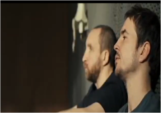
The effect of not using any dialogue is that the audience believe that these men are so determined that they are definitely going to succeed in whatever crime they are going to commit. The exaggerated sounds such as the staple gun causes the simple action of stapling the wall to be a vicious action.
Genre Research 'Psycho IV'
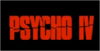
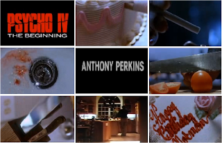
The title of the film appears on screen in large ,bold ,red lettering. The colour red connotes blood and the large slit that cuts through the word 'Psycho IV' suggests that something is being cut.At the same time a sound which resembles bones breaking is played. The title changes from white lettering without any sound effects or cuts running through to the red lettering. This suggests that the letters resemble a person, when the white lettering appears they are alive , then the red lettering show them being killed.
We are first given an insight to the setting as a cake appears which suggests that they are in a house . Which are assured of this when we next see tomatoes being cut and a knife being removed from a stand. The blood which runs down the sink suggests to the audience that he has either cut himself or has injured someone else. There are many close ups used which restricts the audiences view but just shows important props in an effective way.
All of the props used are shown through close up, the effect of this is that the audience are told that these props are important to the film and make them question why?
As we have seen many times befor , the majority of the credits appear in a lare, white , bold font. This is so the audience are not given hints to any events which are going to happen in the film , but also everytime we see this font we associate it with the thriller genre.
Even if you had not heard of the well known thriller 'Psycho' the title would give the genre away. The cotinuous use of knives being shown through the opening sequence also suggests that this film is going to include death, blood and murders.
Monday, 3 January 2011
'Double Indemnity' (Wilder,1944,US)
The title of the film and the opening credits is what immediately gives the audience a hint that this film is going to be a thriller. We know this as the titles appear over the dark shadow of a man limping, on crutches.We automatically ask : 'who is this man ?' and 'why is he injured?'. By holding on to vital information and making the audience ask questions , the job of a thriller is done by leaving the audience wanting to watch more so the answers can be revealed. The large , white capital letters are a title font we have seen in many thriller genres.I believe that this is a very effective way of showing the audience the title as it is very plain and not informative. As the man walks closer and closer the the camera , his shadow takes more and more of the shot over and once his shadow is taken over by the camera , it cuts to the first shot. As he walks towards the screen the soundtrack gets louder and peaks which adds to the suspension. The music which accompanies the car as it speeds down the road adds to the pace of the frantic car.
The setting and location is revealed to us as a car races down a main road , leaving our attention on the sign labelled 'Los Angeles'. Our attention is taken to this as the positioning of the sign is at the front of the shot but slightly left. From this we know that the location that the film is taken place in is a busy urban area. We are told where exactly the film is taking place and do not need to think too much about it. Once knowing this our attention focuses on the car speeding down the road. We ask ourselves 'Why are they in such a rush?' and 'who is it that is driving the car?'. If we were not to ask questions we wouldn't feel the need to watch any more of the film as we wouldn't be left guessing , 'what's going to happen next?'.
From the way that the man has his arm positioned inside his coat we can tell that he has been injured , a gun shot wound maybe. The style of the costume lets us know the era , the wide rimmed hat that he wears lets us know the film takes place some time in the 1940's.
The opening sets up the rest as the story as we are told straight away with the title 'Double Indemnity' that the film is going to be about an insurance payout. Another way in which we are given an insight to the films storyline in when the male enters the building and the lettering on the door reads : ' Pacific all risk insurance C.O'.
Subscribe to:
Posts (Atom)